Timeline and Role and Scope of Animation V3

Here is the third and final version of the Timeline and Role and Scope of Animation:

Timeline and Role and Scope of Animation V2

Corrections: According to people the way I have shown the important date with symbols on the timeline are not easy to understand, so I have fixed this by placing the names of all the important events, people, products and inventions that are on the timeline with a decent font that is easy to read and understand. This in turn will allow people to identify which symbols mean which event, person, invention, movie etc.

The link below is to look at all the research and reasons why I chose theses Events, People, Inventions and Movies etc.

https://amtanimator.wordpress.com/tag/timeline/

The reason I why I chose to present the information I gathered for the History and Role and Scope of Animation in this form of animation is for several reasons. My first reason is that is makes the information placed on the Timeline is to find as well as understandable but this is only due to the fact that it is not only to see but I had to go through several attempts after reviews with a few people that I both knew and didn’t know. Which is were several of the corrections come into such as the Key and shortening the actual timeline at the end because noting that I have seen or looked up so far in this decade I can see as a importance to the History and Role and Scope of Animation. The Second reason why I chose this style to present my information is due to the fact that the combination of the imagery and colours makes the animation noticeable and draws in the attention of the target audience as well as it displays the actual events quite effectively once the correction had been made on this version.

Timeline and Role and Scope of Animation V2 Final

Here is the finished version of my Timeline and Role and Scope of Animation.

Timeline and Role and Scope of Animation

Corrections: Length has been shorten due to the fact that the actual Timeline and Role and Scope went up to 2015 but needed to be cut back because of only a few things in this decade been of importance to the history of Animation so far. The Fonts have been enlarge and aligned due to the fact that they were all over the place as well as the font not all been readable so the size needed to be enlarged.

Mistakes: According to people the way I have shown the important date with symbols on the timeline are not easy to understand, so to fix this I am going to place the name of all the important events, people, products and inventions that are on the timeline with a decent font that is easy to read and understand.

Timeline and Role and Scope of Animation V1

Here is the final version of Animation Timeline and Role and Scope:

Animation Timeline

Mistakes: The first attempt of the Timeline and Role and Scope of Animation according to both my self and the people I have shown stated that the Timeline needs to be cut down near the end due to the fact that I haven’t marked any events yet that are considered important to this decade so far so I either need to cut the end off or fill it in. I also need to enlarge and align the font due to the fact that the actual font is too small making it hard for to read and identify the time period. The font needs to be aligned due to the fact that it makes the actual timeline look neater and more professional.

Click Image to see Timeline/Role and Scope of Animation, then zoom in due to it’s size the actual image appears small but it is massive and needs to be zoomed in on to read.

Timeline Research 1914 – 1945: World War Propaganda

Now the reason why I chose this period for the Timeline and the Role and Scope is because it is one of the beats example of animation during the early 20th Century, this is due to the fact that the style of animation during this period varies and some of the variation are very interesting and can be consider pioneers or inspirations for various styles that we use for today for everyday things. Propaganda has been around for centuries, in fact the term originates from the Roman Catholic Sacred Congregation for the Propagation of Faith, the first official war Pro was produced in the 1914 after the assassination of the archduke of Austria. The aim of propaganda is to attract the attention of the target audience by using unique or distinctive features as well as colours to do so and once the attention of the target audience he propaganda shows the facts and information the creators or desired party wants the target audience to see, often the information on the propaganda can either be complete lies, half truths of the complete truth but is often made to make the desired party look good and the rival party bad.

Here are a few excellent example of how the styles can vary between each other and how they affect the message of the propaganda. For example both images are attempt at recruiting people into the British Militia but how each piece of Propaganda does it is different, the first image does this by displaying fairly accurate images of men and women in military equipment and they are marching into battle. They are also wearing colours that are also eye catching but at the same time represent Britain in some way i.e. the green is similar to British green. The next image focuses on use the sense of patriotism to draw in new recruits by using the British Flag as a means to do so with the big bold words Britishers Enlist to Day. This is marked on the Role and Scope as a means of communication. This is important to the role and scope due to the fact that it is one of the most famous but also key moments within the history of animation due to the fact that it in a sense is one of the very first professional means to draw the attention of people without threatening means and is a marking point in the timeline because it has a wide range of art styles that range of from it in different kinds of advertisement and info graphics.

Time Line Research 3500BC – 400CE: Ancient Egyptian Hieroglyphs

Ancient Egyptian Hieroglyphs were a combination of logo-graphic and alphabetic symbols used to create a form of formal writing as a means of communication. There are other versions of the Hieroglyphics but they are not consider to be the same due to the fact that they are slightly different then the original version, which in it’s formal form was written in curved style and was written on papyrus and wood.

The two informal styles are called Hieratic and Demotic. This is helpful to the Timeline and Role and Scope due to the fact that it one of most important developments of not only Humans communication but also animation due to the fact that it uses a large ranges of imagery, shapes and colours to form the means of communication. Therefor this on the role and scope would have one symbol which is represented by the Communication symbol. This is important not only because of it been a means of communication but because it is one of the very uses of shapes and colours recorded in human history and is classed as a unique style of art because of this and this therefor means that it is a important factor that cannot be ignored.

Although technically this wouldn’t have possible to understand if the Rosetta Stone hadn’t been found, which meant that mankind wouldn’t have been able to translate various ancient languages. Like all ancient means of communication their are universal symbols that we understand even without translating, in fact most languages can be tracked back to the prehistoric period were cave paintings were used as the means of communication.

Chosen Artist Research: Quentin Blake

Quentin Blake was born on 16th December 1932. He attended several schools including Holy Trinity Lamorbey COFE Primary School, Chrislehurst and Sidcup Grammar School – Where his English Teacher J.H. Walsh influenced his love of Literature. Blake published his first piece at the age of 16 in punch magazine. Blake also studied English literature at Downing College , Cambridge from 1953 – 1956 and Received his Post Graduate Teaching Diploma from London University.

Blake later studied part time at the Chelsea School of Art and later Camberwell College of Art. He also gained another teaching degree from the Institute of education and worked at the Royal College of Art for twenty years as a member of illustrations and later the head of Illustrations for six years (1978 – 1986). One of his first illustrations was The Wonderful Button by Evan Hunter, although his first illustration was a children’s book called A Drink Of Water by John Yeoman in 1960. Blake gained a reputation for been a reliable illustrator for producing over 300 children’s books by various authors such as Roald Dahl and Doctor Seuss (Great Day for Up! 1964) also including himself.

Blake has written 35 books all which he has illustrated and was also a occasional presenter for the 1970’s BBC Story Telling Show Jackamory where he not only told stories but he also drew images to go with them. In 1993 Blake, designed five British Christmas issue Post Stamps featuring the Charles Dicken’s A Christmas Carol. He is the Patron for several different organisations such as the Blake Society, Downing College’s Art and Humanities Society, The big Draw Society and The Nightingale Project. Blake also produced several art pieces for several hospitals across the globe mostly in France but some of the main locations these can be found in are London and Paris. Theses art pieces were also published in Blake’s 2012 book, Quentin Blake: Beyond the pages.

In 2007, he designed a Mural on fabric which is suspended above the Ramshackle building opposite the St Pancras Railway Station. Blake designed The Ben’s Cookies Logo and designed several illustrations for Scottish Tv series Squeak!. Blake is also a supporter and a Ambassador for The Indigenous Rights NGO, Survival International. He is also a trustee of The House of Illustrations, a center in London for Exhibitions, Educational Events and Activities related to Illustration. Blake has received The Biennial Hans Christian Andersen Award from the International Board on Books for Young People, due to his contribution to children’s literature in 1987.

Blake was later appointed Commander of The Order of The British Empire in 2005 by The New Years Honors due to his services to children’s literature. In 2002, he was made a Knight of The Ordre des Arts et des Lettres and was later promoted to Officer in 2007. For his work on Mister Magnolia, Blake won the 1980 the Kate Greenway Medal from The Library Association. Blake was a highly commended Greenway runner-up because of his several illustrated works such as The Wild Washerwomen: A Folk Tale by John Yeoman. He also won the Kurt Maschler Award or The Emile for All Join In (Jonathan Cape, 1990) which he wrote himself as well as illustrated.

Blake was awarded the Prince Philip Designer’s Prize in 2011 and received The Eleanor Farjeon Award in November 2012. He was also knighted in the 2013 New Year Honors for his services to illustrations. In 2014 Blake was awarded the Insignia of Chevalier of The Legion D’honneur at a ceremony at the Institute Francais in London. In 1951, Blake began a two year course service in the Royal Army Education Corps and in 1983, he was awarded the Silver Paintbrush for his illustrations in Roald Dahl’s the BFG and was commissioned to illustrate Roald Dahl’s Works e.g. Fantastic Mr Fox and Charlie and The Chocolate Factory. In 2003 a Exhibit in the Somerset House in London called Quentin Blake – Fifty Years of Illustrations and in 2005, he curated a exhibit called Les Demosiselles des Bords de Seine to celebrate the opening of the Petit Palais in Paris. Blake created a five story high wrap for a buiding in St Pancras in 2005 and in 2009, he Produced a Informal Panorama – a giant Frieze that is displayed in Adden Brodes Hospital about great historical figures from Cambridge University, for it’s 800th Anniversary

TPPA Appeal: Ploceidae The Weaver Inspiration

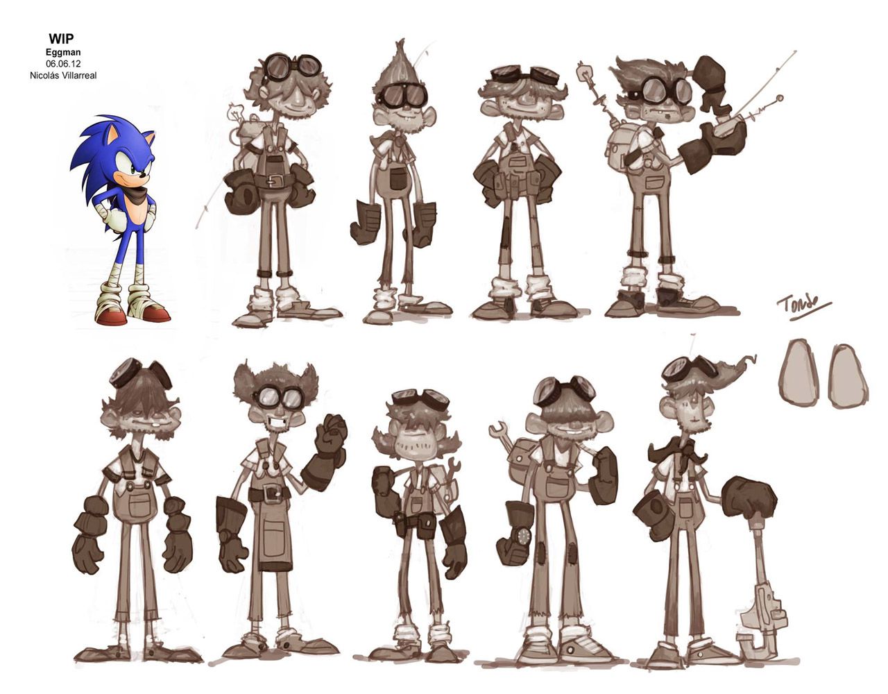
SEGA/Archie Comics: Unfortunately when I attempted to look up some of the artists that produced the concept art all the images where placed underneath SEGA/Archie name, this is due to the fact that sonic was one out of several different character designs that was sent in by SEGA fans to be SEGA’s new mascot for the company. Over the years the artists who developed and designed sonic and other related characters grouped together within SEGA to form the SONIC Team, the group that solely responsible for the sonic games. Later on SEGA sold the rights of creating comics to Archie, with yet again a wide range of artists that brought sonic and his world to life in comic form. Over the years the styles of sonic have changed both in the games and comic due to either the change in modern society (what is acceptable) and due to the artists changing.

Click here to see some examples

I chose this company as one of my inspirations due to the fact that when I did research on the name Weaver it seem to connect to this style of animation effectively and it makes the character seem alive with this sort of name. But this was not the only reason why I chose this, it was also because due to the vast amount of artists that worked both for Archie and SEGA over the years have produced there was a large amount of concept art that I used as inspiration for Ploceidae The Weaver for example:

Sonic’s redesign for the first successful 3D Sonic Game, Sonic Adventure in 1998 by SEGA and the SONIC Team. This was the opening point for various designs for various characters from Sonic’s World, sonic included. This image inspired me to create Ploceidae in similar style, when I saw it, this was due to the fact that the name seam to clack with this sort of art style and it would make it a nice match for his name and characteristic that came with it, as well as presenting it.

Sonic’s redesign for Sonic BOOM in 2014 by Big Red Button Entertainment and SEGA. The game may have not have been very popular due to the fact that had a long list of glitches, but the reason why it inspired me is that the new style for sonic and the other characters gave me an idea, mainly the sports tape, due to the fact that Weaver birds are known for been quite territorial and ferrous fights,s o this gave me the idea to make Ploceidae a Martial Arts expert (Sky Fu) and to present this I would use sports tape.

The Babylonian Rouges from Sonic Riders 2 in 2006 by SEGA and the SONIC Team. This piece of concept art inspired me due to the fact that it was a piece of concept art that focus solely on Bird Mobians and this inspired some of the shapes used for Ploceidae in a sense for his bird like features e.g his beak and eyes but the features on Ploceidae are my own the image only inspired me.

Tracey Yardley: One of the current artists that is working on Archie’s Sonic The Hedgehog Comic series as well as Sonic Universe and the old Sonic X comic. I find this artist inspiring due to the fact that when he draws the characters from Sonic’s World, he captures the essence and personality of the characters perfectly. This can be seen in the image below:

Sonic The Hedgehog from Sonic The Hedgehog comic by Archie Comics and Tracey Yardley. This style of sonic first appeared in issue 160. This style by Yardley inspired me for Ploceidae due to the fact that not only again does his style focus on Mobian Body Styles but he capture the emotions and characteristics of the characters perfectly and now how to display them effectively, so this gave me an idea on how Ploceidae might display his emotions to other around him such as anger and happiness, so I used this image to help me create the facial expressions on the 3D Character Sheet for Ploceidae The Weaver.

Yardley hasn’t just worked with Sonic and his world but also some of Archie’s other comics that are based on other video game characters such as Mega Man and is also the original penciler/inker of the manga series Riding Shotgun.

Click here to see some more of his work:

Aardman Animation: A famous British animation company that is known to favor claymation as the form of animation for their productions. The company has produced various animated series and films since 1972, Some of their most famous works been Wallace and Gromit (Films and Series), Chicken Run, Flushed Away and Shaun the Sheep (Both Series and film).

Click here to see examples of their work:

A found inspiration in the movie Chicken Run and in it’s concept art.

Chicken Run Concept Art by MasterofConcept

Early Concept Art from Aardman Animation’s Chicken Run by Model Artist Michael Salters in 2000. This piece of concept art was useful and inspiring because it gave me the idea on how to capture the beak design for Ploceidae the Weaver in a 3D Setting mainly for the character Sheet but for also later on for the actual producing of a 3D animation. I found this more then enough to capture Ploceidae beak p[perfectly due to the fact that I was having trouble with it in the early stages of his design, due to the fact that I couldn’t seem to get Ploceidae beak to work on the bottom half of his face.

IMG_20150221_0002_NEW

This can be seen in the original 2D Character Design Sheet, the beak doesn’t cover his lower half of his face completely.

Scan 9

This was changed though for the final 3D Character Sheet for Ploceidae The Weaver, you can see this if you look carefully enough you can see all the changes to the 3D versions that I got from looking at my inspirations again. Such as the the beak now completely covers the lower half of his face now and that it appears more 3D like in design. The Chicken run Concept art also inspired me some of Ploceidae other features such as his hands, which by most Mobian standards should have gloves on but Chicken Run gave me the inspiration to make his hand from his wings giving him a more bird like appearance.

Timeline Research 1923: The Walt Disney Company is founded

On the 16th October 1923, The Walt Disney Company was founded by Walt and Roy Disney but was originally called the Disney Brothers Cartoon Studio and took this name for a long time until 1986 where the name was changed in honor of Walt Disney after his death by order of Roy Disney, who later died 2 months later. The Walt Disney Company became the leading animation studio in the American Animation Industry for years and eventually reached out into different sectors of New media such as Live action film production, Television and travel, as well as theater, radio, publishing and online media. The first film that was produced by Disney that involved was Alice in wonderland in 1923 and one of their very first characters designed was Mickey Mouse in 1928 and is considered the successor of Oswald the Rabbit the Half brother of Mickey. On the 18th July 1955 the first Disney land was finished and opened to the public by Walt Disney, the park was originally built because Walt wanted a place for his children and grandparents to go when he worked on his animations, while his brother financed the company. I believe that this is one of the most important events in the history of animation due to the fact that The Walt Disney Company is one of the biggest companies that is involved in the Animation and New Media In world. This reason for it’s succession is due to the fact that a majority of Disney’s productions are actually produced with a certain target audience in mind but even with that the films appear to attract the attention of people of all ages. This section is considered as historical.

Timeline Research 1920: Debut of Thomas the Cat

Thomas the Cat is considered the predecessor of Felix the Cat and one of the very first colour animated cartoons recorded in the early 20th Century. The plot of the animation is fairly basic, Thomas from a young age is raised to catch mice but due to a unfortunate misunderstanding of the difference between a mouse and a Rat, Thomas goes after the Rat. The animation is fairly short with the span of five minuets playing time and I personally think that even though it is a fairly basic animation it was quite successful due to the fact that the actual animation runs quite smoothly and is funny as well due to the story been quite basic that the humor is see able and understandable. I personally believe that Thomas the cat was the very first animated cat that has been recorded down in animation history and he is a key point in that history because of this and this make him an important figure. This animation is classed under Entertainment and cartoon.

Timeline Research 1914: Gertie the Dinosaur

Gertie the Dinosaur, was an animated short that created and animated by Winosaur McCay, the animation is a total of fifteen minuets long because the animation uses and is the very first animation that includes an animated Dinosaur. I believe that this is one of the best examples of early working forms of animation that is recorded in the early 20th Century due to the fact that the animation moves so smoothly and appears to be really realistic, except for maybe a few of the movements Gertie performs such as her moving her legs, she often over exaggerates her legs by moving back and forth before moving further forward. The animation was set up, so that it appeared that Gertie did what her creator told her to do when he asked her to do it or did something that was close to that command. Gertie may have been McCay’s most successful animation, he produced other animations before he created Gertie, which was called Little Nemo in 1911 and  How to operate a mosquito in 1912. He did plan a sequel called Bertie the Sequel but he later abandoned. This is classified under Entertainment and Inventions.