Comic Project

A few months ago I started a comic based project, the projects premise will be kept secret for now. But for now this post is to display the prototype template of possible future covers of comics.

Prototype

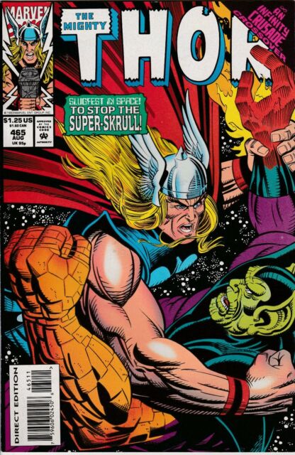
The prototype cover is based on some of the early comic covers from Marvel Comics. While there isn’t much physically on the cover such as an art piece or sketch the main focus was to make usual for more than one comic idea.

Image result for old marvel comics

The two boxes in the top left of the comic are based on the marvel comics logo that was often placed on the comics to show who the publisher is, this is still used today but it depends on the artist and the company. From this I have based my original AMT Animator and re-purposed to be AMT Comics a play on my own name and in honour of the famous comic publisher Marvel. The second box focuses on the date of when the comic was either published or went on sale, I my prototype’s case the day I start working on the comic. The signature in the bottom right of the comic is my own logo to show I was the artist behind it.

Inktober 2018 – Day 4

Inktober Day 4

Attempting the 2018 Inktober event to improve my own artistic capabilities with hand drawn art. Originally attempted to draw a dragon but as I continued it  started to turn into a bird that had either horribly mutated due to unknown causes or it is a simple monster bird of sorts. Either way this was a nice start to this event and I hope I can upkeep this standard or improve it as I continue.

Professional Practice: Logo Ideas 1

As part of my my final year course I need to start trying to place my self into the outside world by learning this skill that is not only necessary but also important in this line of work as it is heavily integrated within the it’s existence. In other words you cannot be part of the artistic world regardless of which place you are in, without been involved within the system that has been set up by artists for generations. An artist makes their way through the world by trying to get noticed by other artists and clients to not only for job opportunities but also experience and improve of ones skill. In order to get started with this process I need to set up several things to help with this process the first been a logo something that can be associated with me as an artist and I have decided that for the logo and name that I will use for myself within this industry is the name that I chose for this blog when I first started my blog, Amtanimator.

I have gone through several different designs over the past few weeks trying to find the right design, the images below are some of the earlier designs that I have come up with.

Amtanimator Logo prot

This one of my first design ideas for the logo, I have gone with something that might be considered quite basic due to the fact that the design is in all a sense one long continues line. In appearance is quite bland and when I drew it I knew that it was lacking something so I decided to do something with the design. This design has one major fault apart from its lack of  umph, which is that it is hard to make out the Amtanimator in the design the A is clear to see as is the M even if the line goes through it (making it some what harder to understand that the A). The T is another fault in the design of this version of the logo as it is hard to work out once is forms an oval that passes over and then goes through the A making the T look more like a D which is not what I wanted and it makes the logo harder to work out. The final fault in this version of the design is that the arrows in the end was originally intended to be a pencil head to represent that I worked as an animator but unfortunately this is not identifiable when looked at.

Amtanimator Logo proto 2

This next image is me attempting to improve my first design at the beginning of this post. As you can see I have taken the original design which is posted in the top left of the image above. From here I have taken that design and altered it several times in several experiments from colour to adding more to image. My first attempt was to add more to the arrow to make it look more like a pencil to show the animation side of my logo. While the pencil did become more clear I began to notice what would be the downside of the design in general. The pencil stood out effectively the down fall was that the actual colours I placed between the lined logo it became such an eye saw since the design was unbalanced with the fact that the so much of the design could be coloured but this rest couldn’t and when I tried to colour the entire background with the same colour it came out looking even worse according to several people that I showed the design too. At one point I manipulated the lines of the design to try and remove the D design that was unintentionally created, this still did not make a difference in the design and didn’t fix the colouring issue.

Amtanimator Logo PrototypeAmtanimator Logo Prototype 2

Creative Futures: Pro Practitioner, Client Project: Women of the World or WOW! Animation Prototype 17

Here is another prototype version of the Women of the World/Women of Hull Animation:

I have extended the opening sequence to the animation to included the Hull city of culture we are Hull, to make it connect with the Women of the World festival, it does give the target audience more time to read all the women who were chosen to be shown in this project but it is a bit to flashy I may need to look into it. I have also added three more animation, the trawler for Lillian Billoca, a pair of scissor for Emily Clapham and a bee buzzing by for Jean Bishop. Although the Trawler animation might need to be extended as it seems to end to soon. The scissor animation ends too soon and should cut across the whole fabric making ti look more realistic. The bee animation is rather emotionless it needs to zip about the screen more to make it look more been like.

Independent Practice – Final Major Project: Bubble and Squeak: Colour Puppetmotion Experiment 1

Here is another Puppetmotion Animation, the difference with this version is that the handmade puppets are coloured this time.

The colours that I have add with the different cutouts of colour paper and card has made a huge difference with the animation. It has made the colour look not only a lot more presentable but it is also add unique characteristic to both them and their props. I will need to make more puppets out of these different colours since it adds a nice affect not only to the puppets but also the animation it’s self. The only down side with this animation is that when I did this new colour based  it made it a lot harder to work with Squeaks as he now had more than the necessary parts and the kept getting jumbled up when I was moving the limbs into the set positions. Next time I will try to keep the puppet parts and colour simple as in it doesn’t make it hard for me to move the parts around when I am animating.

Independent Practice – Final Major Project: Bubble and Squeak: Puppetmotion Experiment 1

I have decided to do a puppetmotion animation for Bubble and Squeak which is done out of card, pencil and pen:

The reason behind me suddenly wanting to do Bubble and Squeak in stopmotion puppet animation is that when I was testing out how the animation would look like if i did this manually by hand and he good new is the result is very entertaining and amusing. My characters even if they are quickly created puppets in this case move and look like their own individuals, they are their own characters. While the video and animation is a bit rough since it is my first time, I think that this is the best means of animating my character in order for them and the animation to achieve their potential.

Independent Practice – Final Major Project: Bubble and Squeak Sketches 4

These sketches are more Bubble and Squeak random scenarios done out of pencil:

img_20170111_0001

These sketches were more focused on Bubble and Squeak’s emotions and how they effect their affect their bodies in the process.

img_20170111_0002img_20170111_0003img_20170111_0004

These sketches were some of worst compared to my previous sketches that I did earlier on but it helps me visualise what my characters are like as well as what sort of scenarios they could be involved in and the more I do this the better understand of these characters I get. For example the very last sketch is an idea that has been buzzing in my head for a while now since I sketched the two characters eating together involving may be something happening to their food such as it running out from the m eating too much of it or that it get’s stolen or it disappears something like that.

Independent Practice – Final Major Project: Bubble and Squeak Sketches 3

These sketches are of Bubble and Squeak in various positions and facial expressions to help not only myself understand what sort of actions the characters would get up to but also how these actions affect them, these sketches were done in pencil.

img_20170110_0007

The first row of sketches was to show Bubble and Squeak portraying various facial expressions. The first image is that of a Bored Bubble and Squeak, the next sketch was of something upset Bubble and Squeak, after that a shocked and surprised bubble and Squeak. The larger sketch underneath I placed Bubble and squeak in scenario were the two have spent all day playing and are now tired. I did all of these scenarios to breath more life into the characters and make them more relatable to the target audience.

img_20170110_0008

This next image is of Bubble and Squeak placed into two new scenarios, the first one the two greedy tikes have eaten all their food. This scene came to picture when I had an idea to involve one of their adventures with food so that is an interesting possibility in the future. The next scene is of something terrifying bubble and Squeak into their own unique hiding positions.

img_20170110_0009

The next scene that I sketched out are Bubble and Squeak getting annoyed at something of screen. The next sketch is of Bubble and squeak sleeping next to each other and the final sketch is of the two winking to the audience.

img_20170110_0010

The next sketch was based on another idea I had for the main animation involving either the food pelts been located high above the tank they share or something is happening above the two, hence why Squeak is pointing above. The next sketch is of the two characters getting angry at either each other or another character.

img_20170110_0011

This next image has two sketches one of Bubble and Squeak crying at something off screen, I decided that a full body shot would add more to the emotional scene. The net shot which is a bit odd due to me miss judging Squeaks arm proportioning, this scene was put together to show the two characters friendship.

img_20170110_0012

img_20170110_0013img_20170110_0014img_20170110_0015

To highlight their friendship more I crafted several scenes that do so such as them give a friendly hug or Squeak’s trying to get his friend out of his shell metaphorically and literally. All these scenes have helped me understand the relationship between the two characters as well as helping display how close the two are to the audience before I have actually animated them.

Creative Futures: Pro Practitioner, Client Project: Women of the World Maureen Lipman/Phone Sketches

img_20170110_0006

These are some basic phones sketches for Maureen Lipman the famous actress from Hull who performed in several famous pieces and was part of the modern Shakespeare theater but she is most famous for doing several BT adverts, which is why the Phone is one of the chosen logo. Most of the phone adverts are from the 70’s and 80’s so I have chosen a phone from that era.

old_telephone

So most of designs are based of model phones such as this, hence why most of the designs have a large base and are used to hold the actual ear piece. This was chosen to not only display what Lipman once did or was famous for but also the period that she is from. This not only draws in the target audience but also for the ones who know about Lipman should intimately know who the women is that I am referring to.

Creative Futures: Pro Practitioner, Client Project: WOW Storyboard 6

This post is another storyboard attempt for Famous Women of the World project done in Pen:

img_20170110_0001

I haven’t change the first storyboard panel that much since the previous one the only change to this original one is that I tried the protest banners for Lillian Billoca. Unfortunately the idea didn’t work as I planned once I sketched it down, not many people saw the connection to Lillian or recognised it what the image was.

img_20170110_0002

No change in this version apart from more frames introduced to make the scenes last longer.

img_20170110_0003

Sweet face was introduce on the end frames but no one saw the connection to the Norma Waterson, so I should maybe go with another one of her songs maybe Dirty old town, since that is a more recognised song that she wrote.

img_20170110_0004

These last three frames before the ending frame are based on Tracey Thorns Plain Sailing, unfortunately not many people recognised her via this maybe I should try another idea such as showing the entire boat sailing across the ocean. This would not only make the animation more recognisable to Tracey thorn but also allow the target audience time to look at it to work out what it actually is.

I have posted a better version of this storyboard that is a lot more clearer to see on my first animated attempt of this project. where I have talked about all the changes that I will be begin to make to improve this project for the better.